Get started with Power BI service
https://docs.microsoft.com/en-us/power-bi/service-get-started
Get started with Power BI service (app.powerbi.com)


This tutorial helps you get started with Power BI service. For an understanding of how Power BI service fits in with the other Power BI offerings, we highly recommend that you start by reading What is Power BI.

Power BI service has a free version and a Pro version. No matter which version you're using, if you already have an account, open a browser and type app.powerbi.com to open Power BI service. If you're a new user, we recommend starting at www.powerbi.com instead. From here you can learn more about Power BI before logging in to the service. When you're ready to try it out, select the Sign up free link that you'll see in the upper right corner. If your administrator has already enabled Power BI for you, don't use the Sign up free button, but instead go directly to app.powerbi.com.

If you're looking for help with Power BI Desktop, see Get started with Desktop. If you're looking for help with Power BI mobile, see Power BI apps for mobile devices.
Tip
Prefer a free self-paced training course instead? Enroll in our Analyzing and Visualizing Data course on EdX.
Visit our playlist on YouTube. A good video to start with is Introduction to Power BI service:
Microsoft Power BI helps you stay up to date with the information that matters to you. With Power BI service, dashboards help you keep a finger on the pulse of your business. Your dashboards display tiles that you can click to open reports for exploring further. Connect to multiple datasets to bring all of the relevant data together in one place. Need help understanding the building blocks that make up Power BI? See Power BI - Basic Concepts.
If you have important data in Excel or CSV files, you can create a Power BI dashboard to stay informed anywhere and share insights with others. Do you have a subscription to a SaaS application like Salesforce? Get a head start by connecting to Salesforce to automatically create a dashboard from that data, or check out all the other SaaS apps you can connect to. If you are part of an organization, see if any apps have been published for you.
Read about all the other ways to get data for Power BI.
Step 1: Get data
Here's an example of getting data from a CSV file. Want to follow along with this tutorial? Download this sample CSV file.
- Sign in to Power BI. Don’t have an account? No worries, you can sign up for free.
- Power BI opens in your browser. Select Get Data at the bottom of the left navigation bar.

- Select Files.

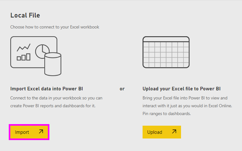
- Browse to the file on your computer, and choose Open. If you saved it in OneDrive for Business, select that option. If you saved it locally, select Local file.

- For this tutorial we're going to select Import to add the Excel file as a dataset that we can then use to create reports and dashboards. If you select Upload, the entire Excel workbook is uploaded to Power BI where you can open and edit it in Excel online.
- When your dataset is ready, select View dataset to open it in the report editor.
 Since we haven't yet created any visualizations, the report canvas will be blank.
- Take a look at the top menubar and notice that there is an option for Reading view. Since you have an option for Reading view, that means you are currently in Editing view.
 While in Editing view you can create and modify your reports because you are the ownerof the report; you are a creator. When you share your report with colleagues, they'll only be able to interact with the report in Reading view; they are consumers. Learn more about Reading view and Editing view.A great way to get familiar with the report editor is to take a tour
Step 2: Start exploring your dataset
Now that you've connected to data, start exploring. When you've found something interesting, you can create a dashboard to monitor it and see how it changes over time. Let's see how that works.
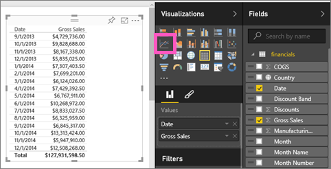
- In the report editor, we'll use the Fields pane on the right side of the page to build a visualization. Select the checkbox beside Gross Sales and Date.

- Power BI analyzes the data and creates a visualization. If you selected Date first, you'll see a table. If you selected Gross Sales first, you'll see a chart. Switch to a different way of displaying your data. Let's see this data as a line chart. Select the line chart icon (also known as a template) from the Visualizations pane.
- This looks interesting, so let's pin it to a dashboard. Hover over the visualization and select the Pin icon. When you pin this visualization, it is stored on your dashboard and kept up-to-date so you can track the latest value at a glance.

- Because this is a new report, you'll be prompted to save it before you can pin a visualization to a dashboard. Give your report a name (e.g., Sales over time) and select Save and Continue.

- Let's pin the line chart to new dashboard and name it "Financial sample for tutorial".

- Select Pin.A Success message (near the top right corner) lets you know the visualization was added, as a tile, to your dashboard.

- Select Go to dashboard to see the line chart pinned, as a tile, to your brand new dashboard. Make your dashboard even better by adding more visualization tiles and renaming, resizing, linking, and repositioning tiles.
 Select the new tile on your dashboard to return to the report any time. Power BI returns you to the report editor in Reading view. To switch back to Editing view, select Edit report from the top menubar. Once in Editing view, continue exploring and pinning tiles.
Step 3: Continue the exploration with Q&A (natural language querying)
- For a quick exploration of your data, try asking a question in the Q&A box. The Q&A question box is located at the top of your dashboard (Ask a question about your data) and in the top menubar in your report (Ask a question). For example, try typing "what segment had the most revenue".

- Q&A searches for an answer and presents it in the form of a visualization. Select the pin icon
 to show this visualization on your dashboard too.
 - Pin the visualization to the "Financial Sample for tutorial" dashboard.

- Return to your dashboard where you'll see the new tile.

Next steps
Ready to try more? Here are some great ways to explore Power BI.
- Connect to another dataset.
- Share your dashboard with your colleagues.
- Read tips for designing dashboards.
- View your dashboards with a Power BI app on a mobile device
Not quite ready to jump right in? Start with these topics designed to help you feel comfortable with Power BI.+
- Learn how reports, datasets, dashboards, and tiles all fit together
- Visit our Power BI Guided Learning site and take a few (very short) courses
- Watch some Power BI videos
- See what samples we have available for you to use


Comments
Post a Comment